Projects / Kibixy

Case study · 2024 · Graduation project · Service · Space · Brand · App

Turn reading back
into an adventure.

Kibixy is an interactive children’s library - a playful space, a character-led brand and a companion app that bring kids back to physical books.

Role
Solo · graduation project
Timeline
4 weeks · 2024
Type
Service · Space · Brand · App (UI/UX)
I did
Research · Service design · Space · Branding · UI/UX
In 30 seconds

The short version

01 · Problem

45% of the kids we surveyed read for fun only rarely. Libraries feel passive next to screens.

02 · Insight

Kids already read on screens; parents still want books. 80% would read more with interactive features.

03 · Solution

One experience in three layers: a playful space, a character-led brand and an app that leads back to the shelf.

01Why kids stopped reading

Kids still love stories. Libraries stopped competing.

2012: 38% of kids read for fun every day.

2021: just 25% - and 1 in 5 never do.

The library barely changed in between.

Source: Farshore Consumer Insights research, reported by ReadingZone.

In our survey, 44.8% of children read for pleasure only rarely - and more of them read on devices (35%) than in a library (15%). Libraries still offer quiet rows of shelves.

Reading for pleasure · Children 0-17 · 2012 vs 2021

Fewer kids read every day - and more never read at all.

Read daily for pleasure

201238%
202125%

−13 pts in under a decade

Never read for pleasure

201213%
202120%

+7 pts - 1 in 5 children

UK children aged 0-17 reading for pleasure “every day or nearly every day” vs “never”, 2012 vs 2021. Source: Farshore Consumer Insights research, reported by ReadingZone (30 March 2022).
Problem statementChildren are drifting from physical books because digital entertainment is simply more engaging - and traditional libraries offer few hands-on, playful reasons to visit.

The opportunity: if kids already live on screens, use them as the doorway - and make the library the place they want to end up.

02What we heard

Kids aren’t bored of stories. They’re bored of sitting still.

How I got here · 12 weeks, Feb → Apr

  1. 01 · FebTopic research
  2. 02 · FebSurvey · kids + parents
  3. 03 · FebInterviews · kids, parents, teachers
  4. 04 · Feb-MarCompetitor analysis
  5. 05 · MarSynthesis → insights
  6. 06 · Mar-AprSpace · brand · app

Survey · Children + parents · Google Forms

Kids44.8%

of kids read for pleasure only rarely - on special occasions or for assignments

Kids35% vs 15%

read mostly on devices, versus in a library

Kids80%

would read more if the library had interactive digital features

Kids60%

sometimes or often struggle to find books that interest them

Parents70%

of parents rate interactive elements as very important

Parents~55%

of parents still prefer physical books for their child

Interviews

Child

“Uninspired by traditional methods - I want interactive and creative learning.”

Parent

“Children struggle to stay engaged in learning beyond school.”

Teacher

“Outdated resources and few interactive materials reduce engagement in class.”

The tension that shaped everything: kids live on screens, parents want books. Kibixy had to use the first to get to the second.

4 alternatives - and the gap between them

OnlinePratham Books StoryWeaver

+ Multilingual books, audio narration, animated illustrations, affordable

− No physical presence; needs devices and internet

Online + physicalKatha Kids

+ Storytelling workshops and digital content, strong partnerships

− Relies on donations; limited reach and spaces

Physical libraryJustBooks

+ Wide range, memberships, branches across India

− Little children’s programming or interactive learning

Library + learning centreHippocampus

+ Dedicated kids’ libraries, storytelling and literacy focus

− City-only; affordability barriers

The gapNo one combines a playful physical space, hands-on programmes and a digital companion for kids - that’s where Kibixy sits.

4 insights that shaped the design

Insight 01
Play is the hook, not the enemy.

80% of kids would read more with interactive features.

→ Interactive zones, AR, sessions
Insight 02
Screens are the doorway.

Kids read on devices; parents want books.

→ An app that leads back to the shelf
Insight 03
Finding a good book is hard.

60% struggle; signage was the #1 pain in the visit.

→ Wayfinding + discovery in the app
Insight 04
Grown-ups need support too.

Parents lack time; teachers lack material.

→ Programmes + a parent space
03Who it’s for

Designed for kids - and the grown-ups who bring them.

RJ
Rajesh, 39Parent · decides the visit

“Less screen time - but not less fun.”

Needs

Engaging, playful and educational time together

AD
Adhiya, 9Child · main user

“Can reading feel like a game?”

Needs

Interactive, fun ways to learn through play

SA
Sarah, 35Teacher · brings classes

“How do I make lessons stick?”

Needs

Fresh, hands-on material beyond the textbook

LS
Library staffSecondary · runs the space

“Can we keep busy days calm?”

Needs

Clear zones, signage and simple programme tools

Storyboard · A family’s visit, today

Six moments - and the one where it falls apart

01Discovery

A family hears about the library from a friend and decides to visit.

02Arrival

They reach the library and are greeted by friendly staff.

03Exploration

Kids rush to the exhibits - but can’t tell where anything is.

04Programmes

The family checks the schedule: storytelling, crafts, STEM.

05Check-out

Kids gather their favourite books and materials to take home.

06Reflection

On the way home they share favourite moments and plan the next visit.

Pain point · Limited signage

Families can’t find specific areas, so kids lose interest and parents get frustrated - the visit feels confusing, not exciting.

Opportunity · Wayfinding kids can read

Clear, colourful signs at every key point, colour-coded zones - and a map in the app that shows exactly where a book lives.

Design goalCreate an interactive library that pairs traditional reading with modern technology - so every visit feels like play and builds a lifelong reading habit.
04The idea

Not a library with an app. One experience, in three layers.

Each layer answers a different insight - and every one of them points kids back to a book.

One kid · three layers · One goal: read more physical books

01
The space
In the library

Colour-coded zones, reading nooks, interactive displays and signage kids can read.

Answers Insights 01 + 03
02
The brand
Everywhere

Six characters, a library card and rewards that make Kibixy feel like a friend.

Answers Insight 01
03
The app
Between visits

Discover books, find them on the shelf, earn rewards, book sessions - with parents in the loop.

Answers Insights 02 + 03 + 04

The loop: discover in the app → find it in the space → borrow with your character card → earn a reward → come back

Six things every layer had to respect

Layout

Open, inviting, clearly defined areas

Accessibility

Wheelchair access, low shelves, multisensory

Flexibility

Furniture and spaces that adapt to programmes

Safety & hygiene

Sanitising, child-safe exhibits and restrooms

Supervision

Parents can see; kids explore freely

Age-appropriate

Zones and content by developmental stage

05Layer 1 · The space

Design the visit first. Then the room.

I blueprinted every step of a visit before drawing a single wall - so the space fixes the moments where families got lost.

Physical evidence
signages, Online maps
Welcoming with clear signage.
labeled sections
Interactive exhibits, touchscreen displays
Program schedule display
Book shelves and displays
Checkout station, Kiosk
Online review platform, Kiosk
Exit signage
Customer actions
Finding the Library
Enters library
Exploring the library
Engage-interactive elements
Participate in programmes
Selecting a book
Checkout
Giving review
Exit The library
Line of interaction
Onstage actions
Customer searches for library physical or digital maps.
Greeted by staff or volunteers.
Interacts with exhibits and displays.
Follows instructions and engages with the content.
Participates in activities or workshops.
Customer browses through shelves and displays
Completes checkout process
Customer fills out review card or feedback form.
Thanked by staff or volunteers on the way out
Line of Visibility
Backstage operations
Regular maintenance of signage
Staff training on welcoming and assisting customers
Regularly updating and maintaining exhibits and displays
Staff training on operating interactive displays.
Planning and organising programs and events .
Regular shelving and organisation of books .
Managing library inventory to track availability of books.
Analysing feedback to identify areas for improvement.
Monitoring and managing exit flow to ensure smooth traffic.
Line of internal interaction
Support process
Offering precise directions on all platforms.
Regular monitoring of entrance area maintenance.
Staff available to answer questions & recommendations
Providing clear instructions and prompts to guide customer interaction.
Promoting program schedule and announcements through various channels.
Offering assistance or recommendations from staff or volunteers
Offering assistance from staff or volunteers
Regular review and analysis of feedback by library management
Regular monitoring of exit area for any cleanliness or maintenance issues.
Service blueprint - physical evidence, customer actions, onstage, backstage and support processes across 9 steps of a visit.

User interactions · One visit, four stages

Every stage mixes space, people, visuals and screens

  • Spatial
  • Human
  • Visual
  • Digital
01
Arrival
  • Signage and online maps
  • Friendly staff welcome families
  • Outdoor play area
  • Vibrant murals and banners
  • Interactive screen display
02
Exploration
  • Cosy reading nooks
  • Volunteers chat with children
  • Colour-coded, themed zones
  • Tablets and touchscreens
03
Engagement
  • Dedicated programme spaces
  • Facilitators and guest authors
  • Kids collaborate with peers
  • Interactive screens + projection
  • Digital feedback forms
04
Check-out
  • Clearly marked checkout
  • Waiting and seating zones
  • Staff help with checkout
  • New arrivals + upcoming events
  • Automated email reminders
Touchpoints across a typical visit - spatial, human, visual and digital. Signage and the map carry over into the app.
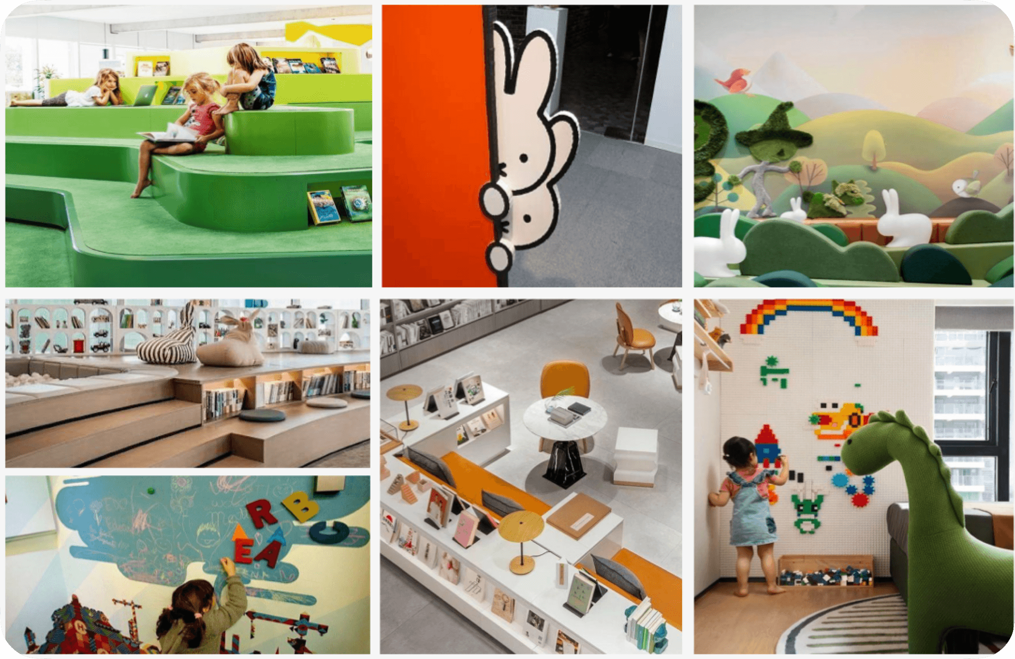
Mood board - children’s spaces that use colour, characters and cosy nooks to invite exploration.

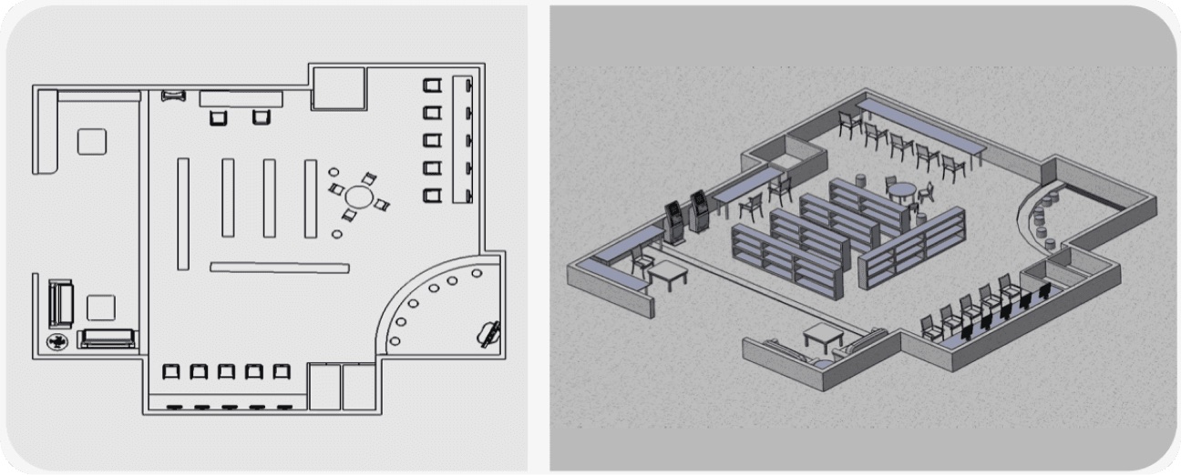
Space plan · 2D → 3D → 11 zones

2D floor plan and 3D model of the library
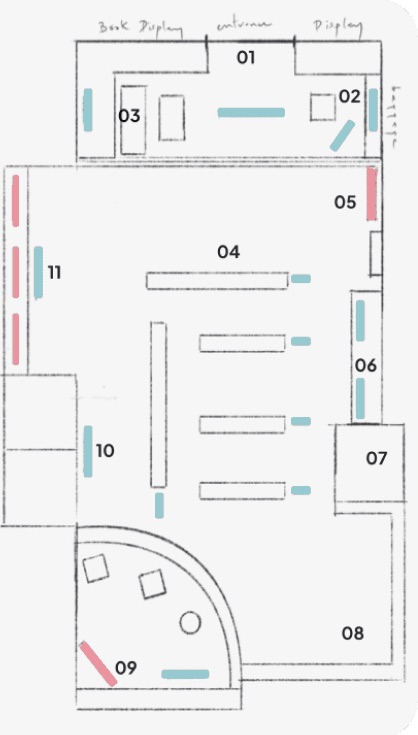
  1. 01Entrance
  2. 02baggage deposit
  3. 03seating area
  4. 04Product Display
  5. 05Book Display
  6. 06Reception area
  7. 07storage room
  8. 08Product display
  9. 09program area
  10. 10restroom
  11. 11Monitors
  • Interactive displays
  • Signage

Interactive elements and signages guide and engage kids through the space

Annotated zone plan
Open sightlines so parents can supervise; pink dots mark interactive displays, blue mark signage. [Add final m² / capacity]
06Layer 2 · The brand

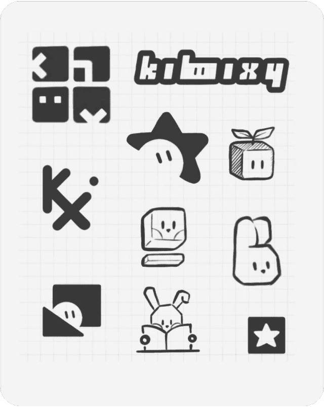
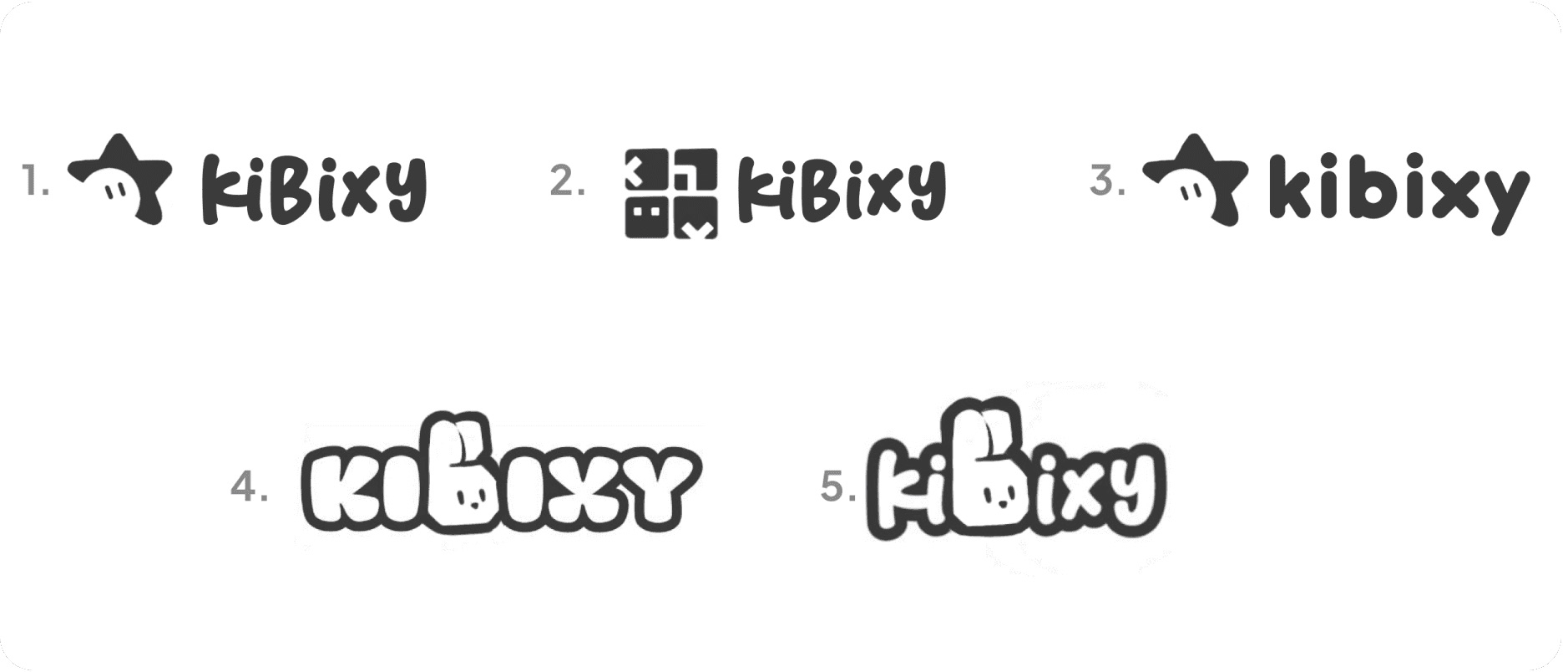
A star, a kid and the letter K. Then six friends.

From a page of pencil marks to a logo a child could draw - and a cast of characters that carries Kibixy into the space, the app and home.

04 · Final: star + kid + K = the mark, built on a grid and tested on every brand colour.

Type

Antipasto Pro

Rounded, friendly headlines - Thin to Extra Bold

Custom rounded wordmark + star mascot

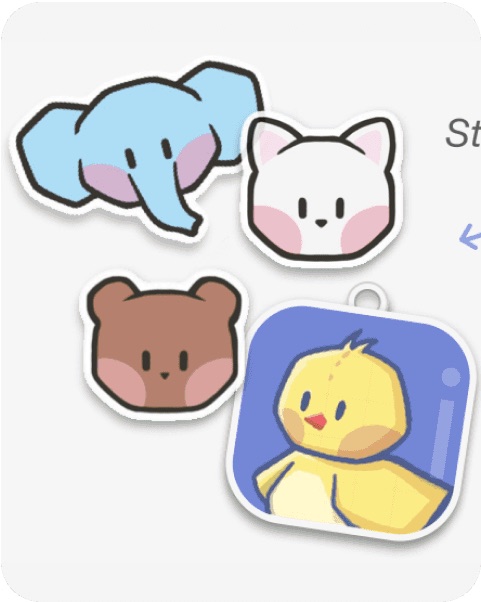
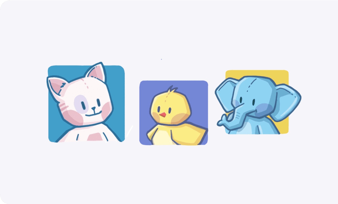
Characters · 6 mascots · One cast everywhere

Brand palette · Soft, high-energy, kid-safe

  • #8687DAPrimary - logo, star mascot, digital UI
  • #9BDCE0Calm - reading nooks and signage
  • #F19DB6Warm - interactive displays
  • #ED977CEnergy - programmes and events
  • #F0CB59Joy - rewards, cards and highlights

The brand in use

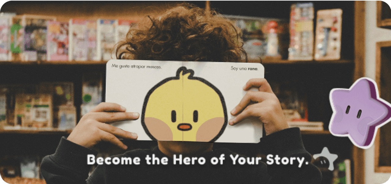
Campaign · “Become the hero of your story”
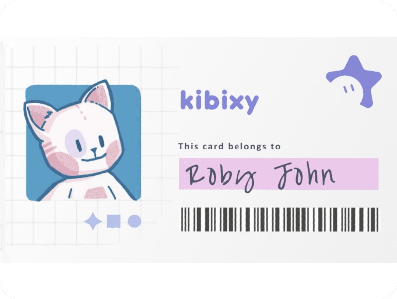
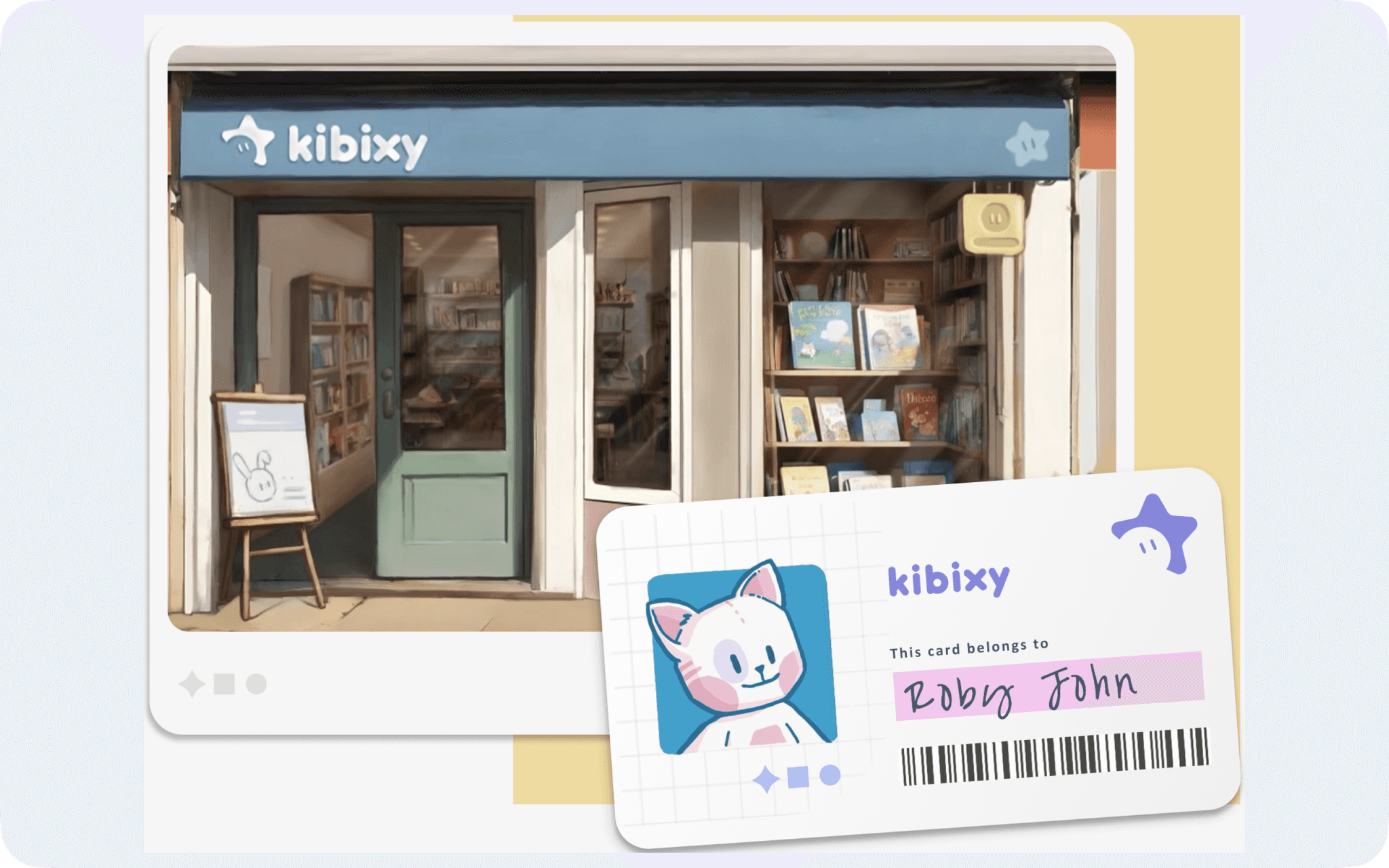
Library card · pick your character
Stickers + keychains = reading rewards
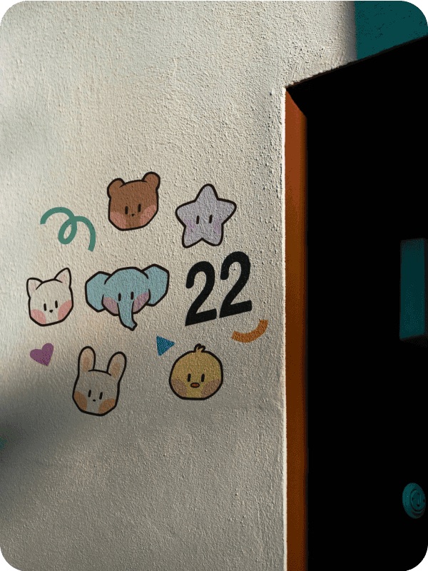
Character mural - heads painted on the library walls
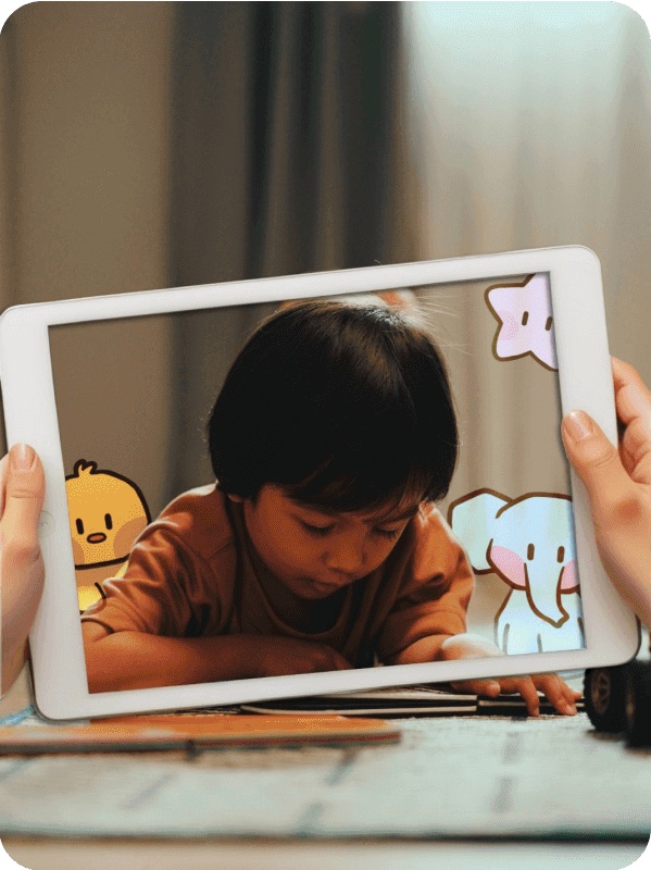
AR on iPad - the cast appears around the reader
Painted portraits - used on the library card and the buddy profile
07Layer 3 · The app

Kids already read on screens. The iPad app walks them back to the shelf.

iPad first, for kids aged 6-10 - big enough for small hands, easy to share with a grown-up, and at home on the library kiosks. Desktop and mobile follow as ideas.

Why an app · Straight from the survey

35%

of kids read mostly on devices

→ Meet them where they already are
60%

struggle to find books that interest them

→ Discovery by mood + a map to the shelf
#1

most-wanted features: audiobooks + interactive storytelling apps

→ Story previews that unlock the real book
P1 · UX principle
Every path ends at a shelf

No endless feeds. Each flow finishes with a book to borrow or a visit to plan.

P2 · UX principle
Kid-first, parent in the loop

Big targets, characters, voice and icons for kids; controls and progress for parents.

P3 · UX principle
Reward reading, not screen time

Stickers and badges unlock for books read and sessions joined - never for minutes in-app.

UX process · Flows → IA → Wireframes → UI → Test

Step 03 · User flows Drafted

The 3 journeys that matter most

Draft flows - rename, add or cut steps. Purple = screen, yellow = decision, outlined = happens in the real library.

A · Find a book → the real shelf (core flow)
Home→Discover · pick a mood→Results→Book detail→Available?→Map · where is it→Walk to zone + shelf→Borrow with card→Sticker earned

If not available → “Reserve it” or “Similar books on the shelf now”. [Decide]

B · First-time setup
Welcome→Grown-up gate→Parent account + child age→Pick your buddy→Your library card→Home
C · Parent books a session
Grown-up gate→Sessions→Session detail→Spots left?→Book + add child→Confirmation + reminder→Attend at Kibixy

Step 04 · Information architecture Drafted

Two spaces, 4 kid destinations

The kid space is the default; the parent space sits behind a grown-up gate. Map lives inside Book detail, not as its own tab.

Kid space · Sidebar (4)
HomeToday’s challenge, buddy picks, continue reading
DiscoverMoods, themes, characters, search (+ voice)
RewardsChallenges, sticker book, badges
My cardBuddy, borrowed books, reservations
Parent space · Behind gate
SessionsStorytelling, crafts, STEM - book + remind
ProgressBooks read, sessions joined
SettingsChildren, time limits, notifications, account

Decided: Map sits inside Book detail (split view). [Open: does the library kiosk skip the gate and accounts?]

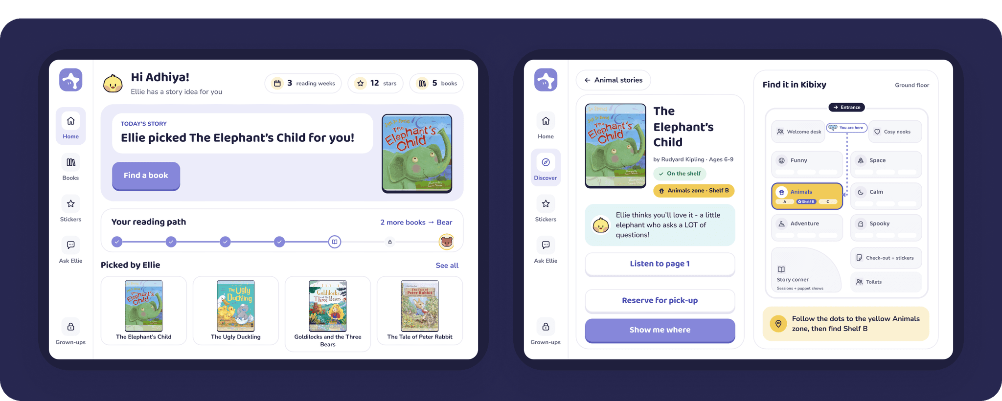
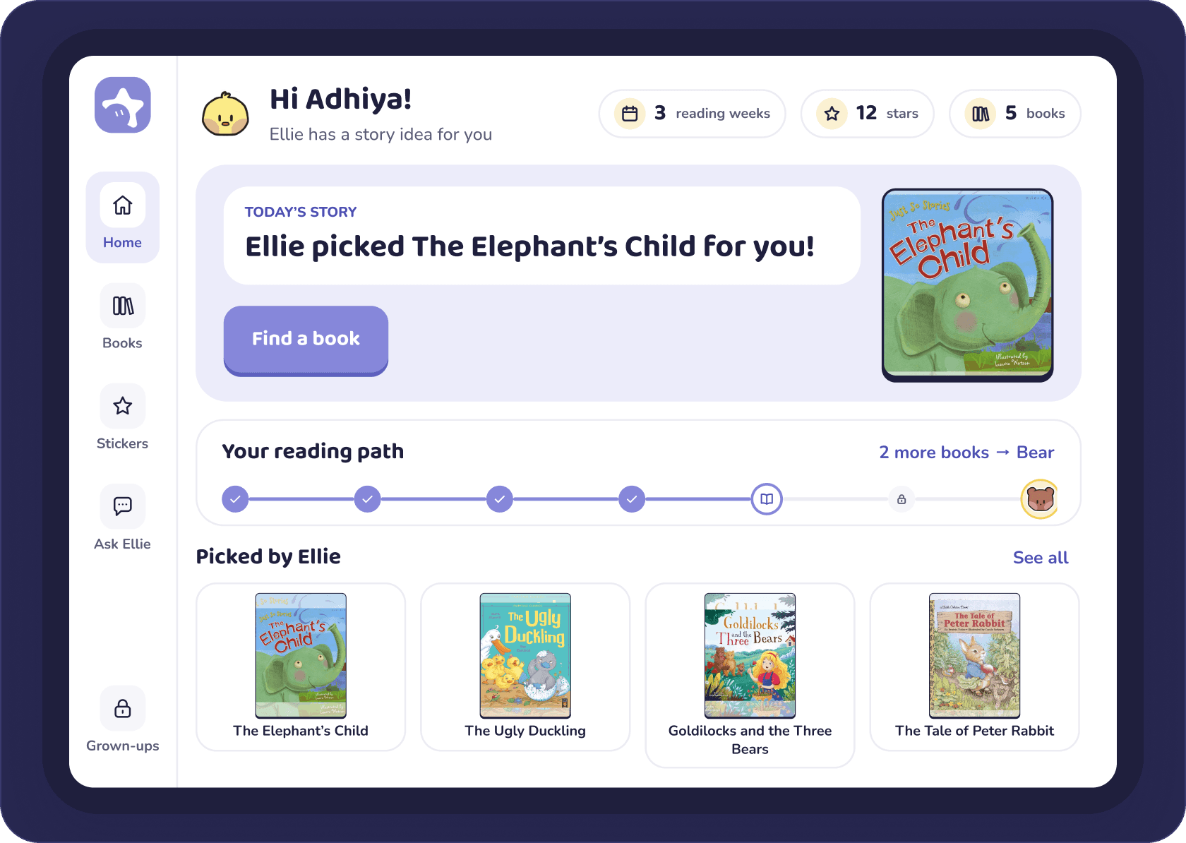
01

Home

Ellie picks one story for today (Headspace-style), and a Duolingo-style reading path leads to the week’s sticker - one big button to start.

  • Today card + flat scene with Ellie
  • Reading path → this week’s Bear sticker
Entry point · sets the playful tone
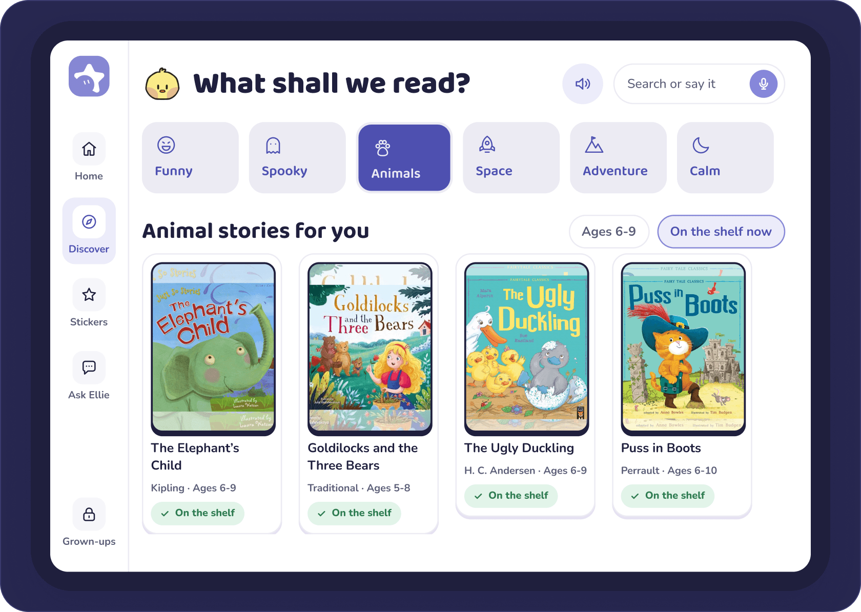
02

Discover

Kids pick a feeling - each one is a library zone with its own colour, icon and name - and get real stories that are on the shelf right now.

  • Six feelings = six zones (colour + icon + name)
  • Kibixy Classics: real public-domain stories
Answers Insight 02 · screens as the doorway
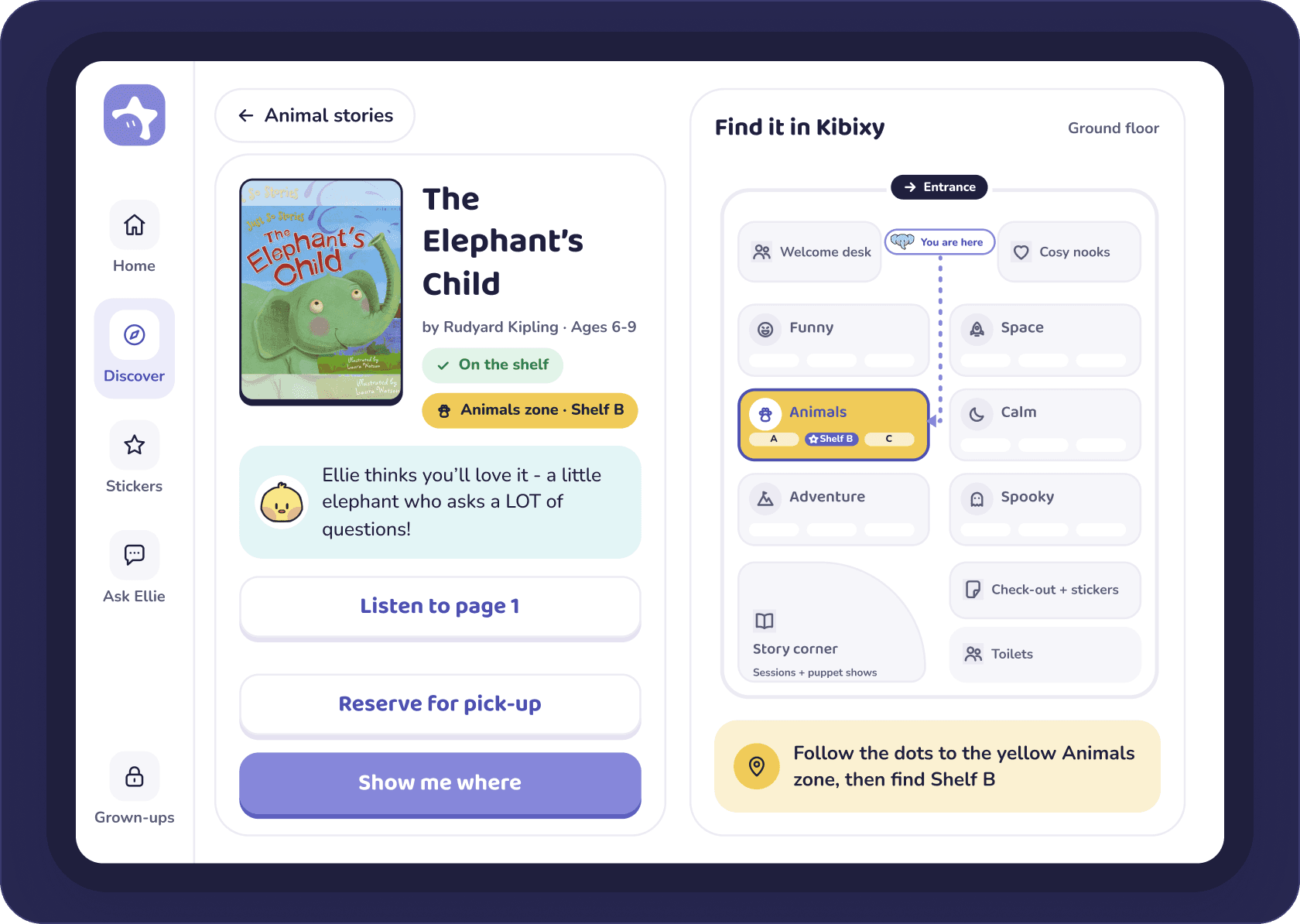
03

Book detail + map

A split view made for iPad: the book on the left, the library map on the right - with the shelf highlighted.

  • Live availability; “Reserve” turns into a toast, not a new screen
  • Zones shown by colour + icon + name, matching the signage
Answers Insight 03 · the signage pain point
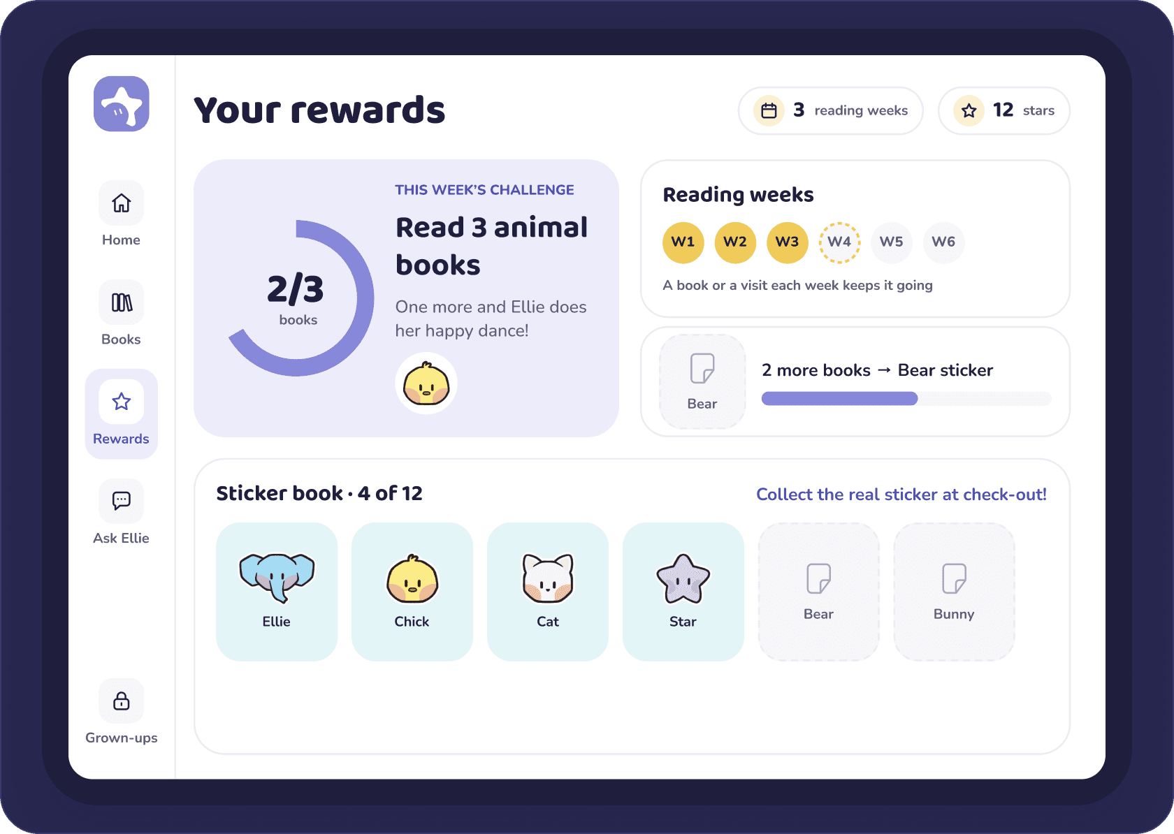
04

Rewards

Challenges and a sticker book turn reading into progress kids can see - and collect for real at check-out.

  • Badges unlock for books borrowed, never for time in-app
  • Matching physical stickers at the desk close the loop
Answers Insight 01 · play is the hook
05

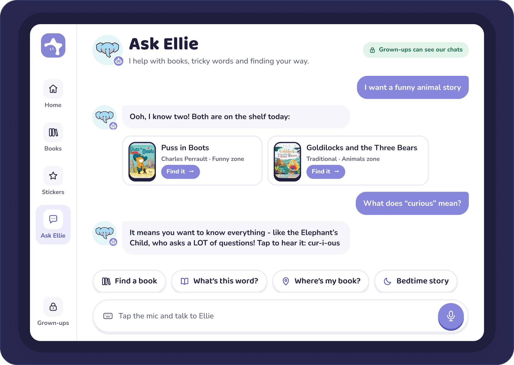
Ask Ellie

A kid-safe AI buddy: it suggests real books that are on the shelf, explains tricky words simply and reads them aloud.

  • Voice first - big mic + tap-to-ask chips
  • Only books, words and the library; grown-ups see every chat
New · AI that leads back to real books

Also in the app

Shown as mockups, not designed in full.

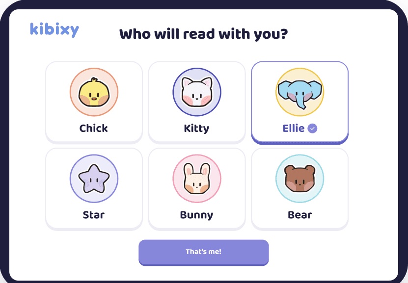
Pick your buddy - six big characters, one tap (onboarding for younger kids)
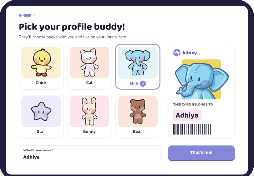
Your library card - pick a buddy, add a name, and the card builds live
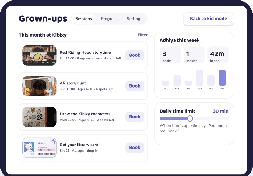
Parent space - book sessions and see progress, behind a grown-up gate

Beyond iPad · ideas for later

The same system, stretched to two more contexts.

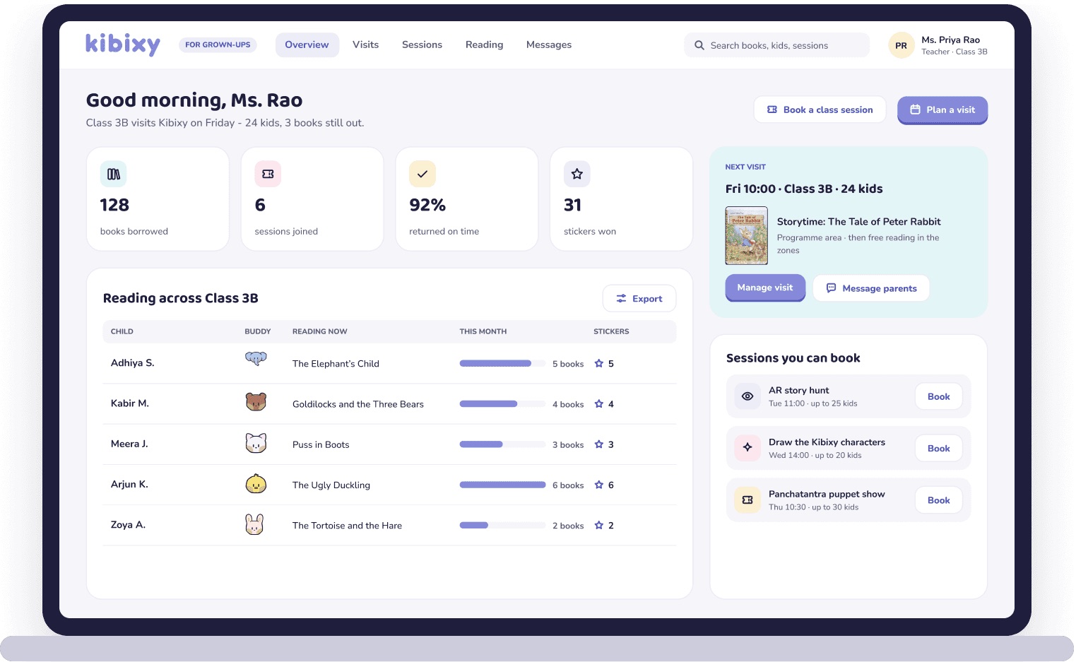
Desktop portal for parents and teachers
Desktop · parent + teacher portal - plan visits, book class sessions, track reading across kids
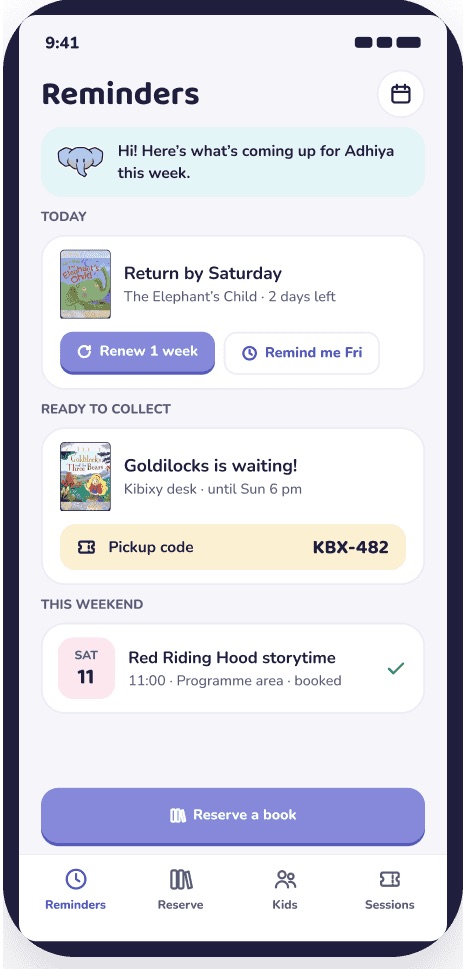
Mobile reminders app
Mobile · reminders - returns, reserve-and-collect, sessions

Ideas for later - for grown-ups only. Kids stay on the iPad; desktop and mobile handle the planning and reminders around a visit.

08Outcome & reflection

Designing for kids is designing for the grown-ups too.

What I learned

01 · Service before screens

Blueprinting the visit showed the real pain (signage) - and the app’s best job: getting kids to the right shelf.

02 · Two users, one product

Kids need delight; parents need trust. The app splits into a kid space and a parent space for that reason.

03 · Tech should point to books

Every digital touchpoint earns its place only if it ends at a shelf.

“Kids don’t need to be told to read - they need a place that makes them want to.”Mehnaz Basheer